Philippe Apeloig
Graphic designer and typographer Philippe Apeloig has compiled a large-format book of photographs of all of Paris’s Second World War commemorative plaques. Combining typography and remembrance, the plaques reveal the whole tragic story of the period.
‘Enfants de Paris’ has just been published. Where did the idea for the book and your interest in the commemorative plaques on the walls of Paris come from?
The project was a long time maturing. You could say it began with Maya Lin’s Vietnam Veterans Memorial Wall, built in Washington in 1982. Those names engraved in stone made a profound impression on me. Then, after the terrorist attacks of 11 September 2001, the missing person posters put up all over New York, where I was living at the time, made a big impact on me. Later, in 2004, my mother had a plaque laid in Châteaumeillant, in the department of Cher, to thank the “Righteous” of the village who concealed her family and others during the Occupation. I then made a number of attempts at photographing the plaques in Paris, which I did not pursue. It was not until five years later that I went back to the project in earnest and put it on my studio’s schedule.
Photographing all the plaques in Paris from the period 1939-45 – approximately 1 500 – requires a lengthy process of cataloguing. How did you go about it?
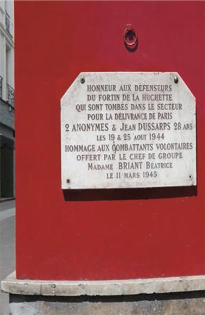
This may seem surprising, but there is no exhaustive database. So we had to begin by cataloguing the plaques from the period 1939-45, comparing the different partial lists and other information we found in various places – at Paris city council’s cultural affairs department, at the Shoah Memorial archives, on websites, in books, etc. – with all the plaques we noticed on our urban wanderings. This investigative work was not done in advance, but throughout the process. While out taking the photos, we would come across new plaques; sometimes, it felt like we would never reach the end! And of course, we had to take into account those that were laid while the book was being produced, which we often discovered by chance.
Was the issue of passing on memory at the forefront of the project?
It wasn’t at the forefront, but it played an undeniable part. By compiling all these traces that are scattered across the city and showing them up close – whereas people walk past them in the street without noticing them – the book is an invitation to remember the past. And as I mentioned before, the book also has to do with passing on my family’s memory.
You are a graphic designer and particular care has been taken over this coffee-table book. Was the artistic aspect key to its realisation?
This is not a history book, but an art book. It was conceived as a design object, from its blank cover – with its bas-relief lettering as if it had been engraved – to its red and blue flyleaves which together with the white inner pages form the tricolour flag, to the choice of typefaces used. The uncluttered layout highlights the beauty and graphic diversity of the plaques. The book also begins and ends with close-ups – as if you were looking at the plaques through a magnifying glass – to draw attention to their craftsmanship. The idea is to reveal the beauty of this urban typographic collection, which tends to go unnoticed.
Why the title ‘Enfants de Paris’?
This poetic title echoes that of the film by Marcel Carné, Les Enfants du Paradis, which was filmed during the Occupation against the backdrop of a Paris replicated in secret by Jewish set designer Alexandre Trauner. It also evokes the opening words of the French national anthem, “Enfants de la Patrie” (Children of the Motherland). Finally, it honours the memory of the young people whose commitment cost them their lives (members of the Resistance, soldiers, the “Righteous of France”) or who were arrested and deported for being Jewish.
Read more
Enfants de Paris, 1939-1945, Philippe Apeloig, éditions Gallimard.
Articles of the review
-
The file

Remembrance tourism in Île-de-France
>In Île-de-France, remembrance tourism is a sector undergoing considerable change. Building on the First and Second World War commemorative cycles, the region has seen, on the initiative of actors like the Ministry of the Armed Forces, the gradual integration of its remembrance sites and cultural...Read more -
The event

The Liberation of Paris: the backdrop for a new museum
On 25 August 2019, Paris celebrates the 75th anniversary of its liberation. For the Musée de la Libération de Paris – Musée du Général Leclerc – Musée Jean Moulin, due to be officially opened that day at Place Denfert-Rochereau, a new page of its history, begun 25 years ago, is being written. ...Read more -
The figure

The MRN: a museum for tomorrow
A completely redesigned Musée de la Résistance Nationale (MRN) is preparing to open at Champigny-sur-Marne, with exhibition spaces housed in a new building and a research centre on the historical site. An ambitious project offering a fresh insight into the Resistance.
Read more